TYPOGRAPHIC COMPOSITION
Melanie Johnson
DVB201 Typography
Week 7
Task 1
Front of cleaning product

Back of cleaning product

1. How many typefaces were used?
Six
2. How do the typefaces relate to each other?
The typefaces are all informative of the brand and its use. The main typeface is in the logo for the brand and centred on the label. The remaining typefaces are of similar size in relation to one another and exists as a means of explaining the product and its benefits.
3. How did the designer use space and alignment to organise the text?
The designer has spaced the text across the entire label, though some areas are busier than others. All the text is arranged horizontally and reads from left to right. The only text with different alignment is the logo 'Pine Cleen' which reads slightly diagonally. The label has three sections of text. The first third of the label illustrates one typeface of three words. The middle third (centre) is the busiest area of the label, with four different typefaces with limited spacing between them. The bottom third consists of three typefaces, spaced relatively close to one another.
4. What were the treatments used to differentiate text and organise information?
Size - All typefaces are illustrated in different sizes throughout the label. The primary information - the brand name, purpose of the product and significant selling points are the largest fonts. Whereas, the more informative text (directions of use etc.) is much smaller.
Scale - The logo is larger than the rest of the text although the difference in scale is not significant. The overall scale of the label in comparison with the rest of the packaging is quite significant. The text takes up majority of the label and the label take up majority of the packaging.
Colour - All typefaces are either green or white, with the exception of one red typeface. The bold colours behind some typefaces, allow them to stand out more than those without a fill. Shadowing has also been applied to some of the informative type to make it more seen amongst the label.
5. What are the other elements of the label?
The elements of the label, excluding the text are the colours (green, yellow and white), graphical icons, the primary logo of the product and an image.
6. What is your opinion about the quality of the label?
The label illustrates a crisp and well informed product. The font is extremely readable and professional, with appropriate colours to match. The overall label is simple, though aesthetic. The only issue with the product would be the amount of text and the variety of typefaces. Some of the typefaces are extremely similar although create a congested and busy graphic.
7. How does the use of type and its organisation on the label influence the aesthetic quality and efficiency of this label?
The typefaces communicate essential information to the buyer and instructions for use of the product. They also advertise positive aspects of the product which assist with marketing. The typefaces compliment the product as they are sharp and clear, the text is bold and concise. Whilst the product label is somewhat mundane and sterile. this matches the product and will appeal to buyers because of its clean aesthetic.
Task 2
Iteration 1 - 2 type, 1 colour

Iteration 2 - 1 type, 1 colour

Iteration 3 - 1 type, 2 colour

Reflection:
This task was fun! and one of my favourites. I did struggle with getting all the information on the page in a professional, yet fun and engaging way. I feel the first iteration best represents the product and although it only uses one colour, there is still variety.
Week 8
Task 1

Iteration 2

Iteration 3

Reflection:
I found this task quite fun although a little difficult to begin with. For me, choosing the hierarchy and designing the type to adhere to this was the most simple part. The more difficult areas were choosing how to balance negative space with the text and the overall layout. I also found it difficult to achieve variation between the three. In saying that, I feel all three represent the same information in different ways and are a creative interpretation of the information presented.
Task 2

1. What is the structure of the content?
The structure of the magazine has three divisions: the introduction (main title and imagery), the information (body of text) and the contact details ("get in touch"). There is a primary heading which introduces the article and subheadings to divide each section.
2. What resources did the designer use to visually represent the structure of the content, to create a visual hierarchy on the page (typeface, position, scale/size, weight, colour, contrast, orientation)?
Typeface: The designer used three different typefaces to visually represent the structure. The first typeface the viewer sees are the subtitles, the second, the body of text and the third, the caption above the article title.
Scale/size: The designer has used scale to create visual hierarchy by making the title and subtitles significantly larger than the body of text.
Colour: The designer has used block colours to divide the body of text into sections so the viewer can easily read from beginning to end and understand that there are three different sections within the body of text. Additionally, the designer has used colour to emphasise areas of the text such as "grow" which has been colour pink in contrast with the white writing.
Orientation: The designer has organised the text from left to right so the viewer reads the information in chronological order.
3. What do you think works? What doesn't and why?
In this magazine, I believe the designer has been successful in categorising the information into sections using colour and subtitles. I also think the contrast between the two typefaces is successful in creating hierarchy between headings and body of text although, a greater contrast between the two typefaces would be beneficial in leading the viewer to the headings fist. The organisation of the imagery creates a confusing and irregular design, causing the viewer to feel overwhelmed when first seeing the spread; this also interferes with the initial hierarchy of the typefaces as the imagery takes away from immediately viewing the heading. I believe a cleaner, more professional and coherent approach to the spread would create a successful hierarchy.

Reflection:
I feel the new magazine reflects a more professional yet attractive spread. Through the use of only two typefaces, one for headings and one for body text, the purpose of the magazine is clear and so is the hierarchy. Additionally, the updated colour palette makes the space less crowded and overwhelming - so does the use of simpler imagery with less typefaces. Overall, I feel the remodelled magazine has a more appropriate order and is a better reflection of the magazine purpose as well as being more readable and less confusing.
PLEASE NOTE: Due to the magazine being a jpeg I was unable to copy the text and images. Most images were found elsewhere and the text has been generated, thus, is not an accurate reflection of the magazine context.
week 9
Task 1


What typefaces were used? How do they relate to the function / message?
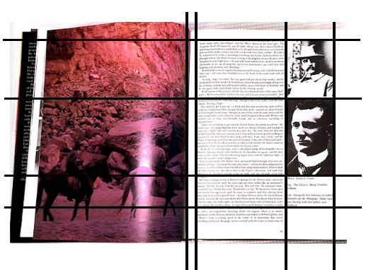
One typeface was used throughout the entire book. This typeface is successful in creating a professional and informative aesthetic. There are variations of the type used such as upper case, lower case and italics.
What is the hierarchical structure and what were the markers used?
There is limited hierarchical structure in this layout as majority of the text is used for the body and is therefore, purely all informative having little hierarchy. There is hierarchy with the upper case representing the headings of sections and columns dividing the text into easily readable sections. Additionally, the captions are smaller and in italics, which allows them to be read last and in conjunction with viewing the image.
What kind of grid was used (single-column, multi-column, modular, baseline, other)?
A baseline grid was used with a multi-column layout. This suits the type of text as it make the information easy to read and view chronologically.
What elements determined the grid structure?
The body of text, headings and imagery
How do you think the design works overall? What could be improved?
The overall design works well as a simple and professional layout. This however makes it quite mundane to readers. Larger imagery and more of it would benefit the reading experience. I think the choice to use one typeface is a successful one as it makes the design cohesive.
Task 2

ZINE
Typographer profile - Elizabeth Friedlander


Reflection:
I found this task quite challenging at times. Whilst I got the body of text done pretty quickly, the patterning and layout took some more time. After watching the linkedin videos, I became more familiar with spacing, indents, hyphenation and drop caps which was extremely helpful. Once all of this was applied to the text of my zine, I started looking into Elizabeth's pattern work (as suggestion from tutor, Adrian!). At first, I was unsure how I could illustrate the patterns in glyph form, but once I started to look at them as if they were a typeface, the problem became less difficult. I enjoyed making the different patterns and playing with colour and position to see what best suited the zine layout. Overall, I am very happy with the final zine. I feel it compliments the subject and is a creative response to using type in patterning.
